Ensemble
UI/UX CASE STUDY
To transform an in-store experience of buying luxury wear into an omnichannel eCommerce website for a multi-brand retailer with four stores across India
DURATION
May 2019 - October 2019
ROLE
User Interface designer
TEAM
2 User Interface designers,
2 User Experience designers
BACKGROUND
Ensemble was launched in 1987 to decolonize Indian fashion and to provide a space for local designers to display their trendsetting collections and outfits. Started in an old machine toolroom in the historic Great Western Building in Fort, Mumbai it now has four stores across two Indian cities and a clientele that spans internationally. The website designed by our team was the first eCommerce platform launched by them as they only had an in-store shopping experience earlier.
CHALLENGE
During our preliminary research with customers and interaction with the stakeholders, we identified certain challenges that we had to design to overcome. They were :

DESIGN OUTCOME
Bespoke shopping experience
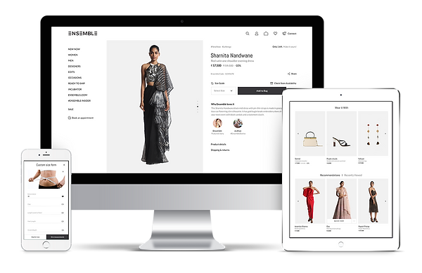
While visiting the store we observed that each customer received styling assistance which made their shopping experience memorable. With going digital, we didn't want to lose this personal touch and incorporated product pairings and styling tips on our product pages. We also made a simplified sizing chart and a step by step guide for taking one's own measurement.
Micro-interactions for feedback
The Visual Language of the website was very minimal and achromatic. We decided to introduce micro-interactions that would add delight to the journey as well as provide feedback for the user's actions. An example of this is the shopping bag icon which mimics the action of putting something in your bag and informs the user of the number of items.
Editorial cross selling
We created a segment called 'Edits' that has articles highlighting the latest trends and collections that cross-sell the products available on the website. This would allow the brand to have a narrative and showcase its expertly curated collections


Press coverage


DESIGN PROCESS
Knowing the brand and client
The first step in the process of creating an eCommerce platform was understanding who the client was and what set them apart from the competitors. This involved workshops, store visits, benchmarking & user interviews. We identified the challenges that they would face while going digital and that they wanted to position themselves as young, glamorous and minimalistic

Breaking down the Target group
The audience group was divided into multiple personas like Existing patrons, Homemakers, NRI’s, Millennials, Bridegroom & family, Design community, Working woman and Tourists. We further broke down each persona into their characteristics and buying behavior. For instance, working women tend to visit the stores during lunch break. They prefer something which is hassle-free and quick. This insight led to a decision to have a ready to wear section on the website with express delivery.

Information Architecture
We created three options for the way the website could be structured and how the users could navigate through it. After weighing the pros and cons of each approach the team ultimately went ahead with the second approach as it was the most natural way for the users to browse the website


Wireframes
After we had the architecture in place we went ahead with the process of making wireframes and the flows for each user journey. We integrated the features that we had discussed in the ideation phase in the wireframes like a simplified sizing guide, editorial section, and styling assistance

Visual design
The process started with taking the Product description page and creating three different design variations of it. We selected one approach and that served as the benchmark for creating individual screens. We created a design system where the iconography, typography, imagery and the visual language of the website were defined. This would serve as a guide for both us and for the brand. The website was responsive and followed a grid structure for easy scaling of the components.


Awards
This project was nominated for “India’s best design project award” by INDIdesign and Pool magazine in 2020 and represented our studio which then ended up winning the "India's best design studio".

Learnings
I have learned many things over the course of this project. The very first thing is to understand the importance of communicating with the client and effectively explaining my design decisions. The second thing would be the realization that going with a minimal and simple approach is often the most difficult to design. Making an easy to use and uncomplicated journey requires a lot of thought and multiple iterations.