Croma
DESIGN SYSTEM & UI/UX CASE STUDY
To create an eCommerce platform and a Store colleague app for an Indian retail chain of consumer electronics with over 12 million customers.

DURATION
3 months
ROLE
User Interface Design - Team Lead
TEAM
3 UI designers + 3 UX designers

CLIENT
Croma is a subsidiary of the Tata Group. It is a large format specialist retail store that caters to 12 million customers in India for their multi-brand digital gadgets and home electronic needs. It sells over 200 brands in 190+ stores across 40+ major cities of India and can be regarded as the equivalent of Bestbuy.

In the Electronics & Media market in India, croma.com is ranked #12 with over 6-7M visits monthly.
Data from https://www.similarweb.com/site/croma.com/#traffic
Project scope

In a duration of three months, I led the UI design team which consisted of three members to create the end-to-end user journeys for the two verticals. For the purpose of this case study, I will be focusing on the eCommerce platform. The Store colleague app is yet to be launched and a case study will follow once that is live 🙋🏻♀️
PROJECT GOALS
To create an eCommerce website that encourages users to buy new products, return for repair services and build a lasting connection for fulfilling their future electronic needs.
WHAT WERE THE PROBLEMS?
Three key challenges
The first step was to audit the existing website, talk to the business team, and conduct preliminary user interviews to uncover the gaps that needed to be filled in.

Design process

Project workflow - My role was to lead the UI team and required close collaboration with the UX & Technical teams

In terms of the methodology, I followed the
three steps of design thinking:
1. Understand
2. Explore
3. Materialize
*I was unable to conduct proper usability testing for my designs but that is something I would want to do for my next project.
BUILDING LOYALTY PROGRAMS
01
Understanding the user research and UX
Empathizing with the users and understanding the business goals is the foundation of the UI design process. In this project, the user journeys were very insightful and allowed me to understand the various buying patterns, level of online vs offline comfort, need for personalized service, and areas of design intervention


02
Exploring & Developing a visual language
The next step was to explore and try various versions of UI style. As this was a mass consumer brand with a target audience that was middle class, the brand had to look friendly, reliable, and trustworthy. This was reflected in the use of our fonts, colors, and imagery used.

03
Materializing the Croma design system
Why was a design system required?
The User interface design for the three products was happening simultaneously. We tackled new modules as well as modified the previous screens based on feedback. And we had just started working remotely. In a situation like this, it was of utmost importance that we had a design system to streamline our design process and prevent design inconsistencies.

What was the framework for the design system?
I benchmarked other established design systems in the industry like Material Design by Google, Carbon by IBM, and Fluent by Microsoft. I analyzed the components, levels of layout, and content to be included. I was also inspired by Brad Forst’s Atomic design methodology and used that as a foundational principle in the creation of the Croma design system.

Establishing the Croma design system
After the selection of a design direction, we created a design system by defining the atomic elements like colors, typography, iconography, and grid structures. We also checked the Color & Type contrast ratio to make the design inclusive and accommodate diverse needs.


04
Creating High fidelity UI screens
Once the design system was in place it was used for creating end-to-end user journeys. 30 user journeys were created for the desktop and mobile of the responsive dotcom. Since showing the design process for all 600 screens is not possible, I have provided a magnified view of one of the key screens and the thought process behind it.

*Click on the images for a magnified view*
Design Outcome
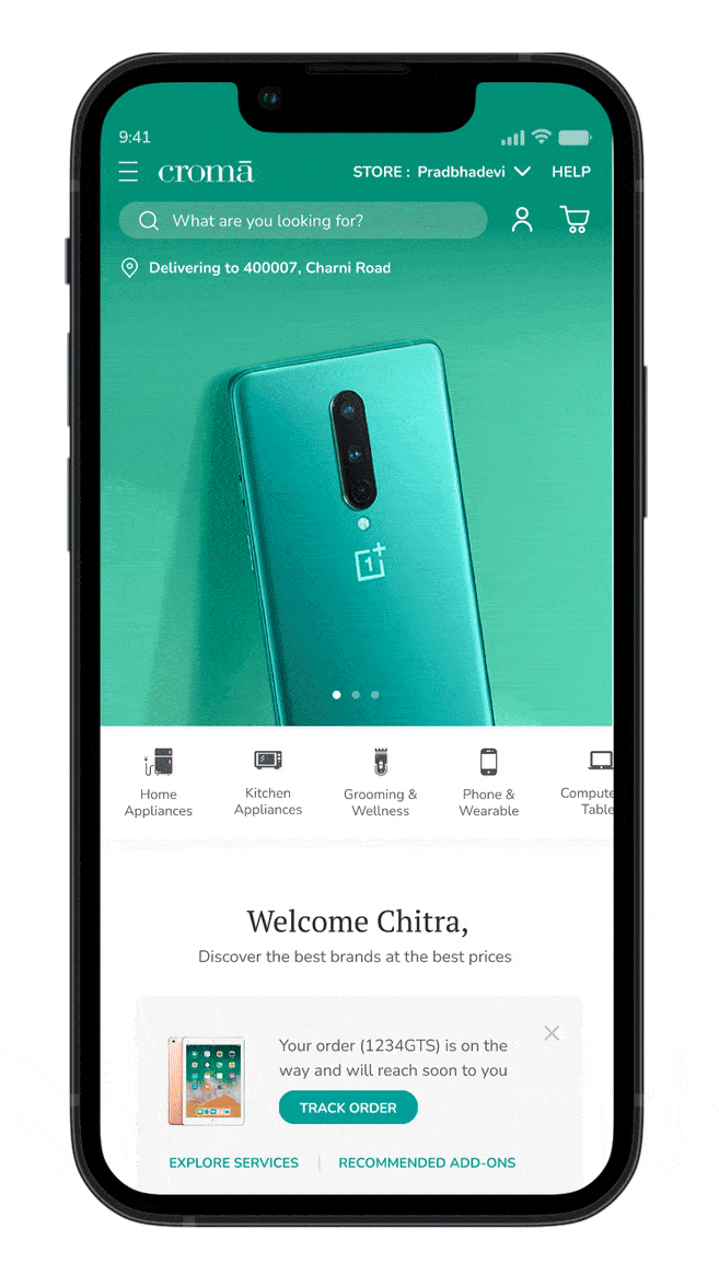
SEAMLESS BUYING JOURNEY
The experience of buying an electronic product was enriched by adding expert recommendations, cross-selling of services and express delivery options
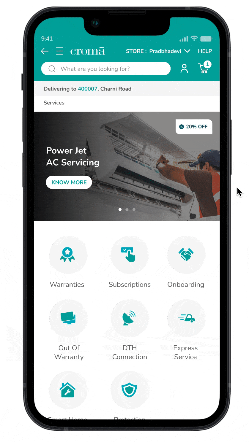
INTEGRATING SERVICES PILLAR
The services aspect of the business was prioritized and integrated into various stages of the product buying cycle
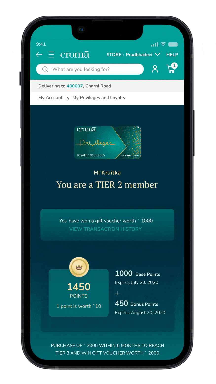
BUILDING LOYALTY PROGRAMS
Creating long term relationships was promoted by highlighting the loyalty programs and rewarding users through the collection of points
Next steps and Project learnings
One of the challenges that this project started with was the inconsistency in the User experience across the various products. Through the work done, we were able to create a cohesive system that would standardize and streamline the platform. This also led to a bigger conversation within Croma about the importance of having a design system and unifying their products.
-
I realized that creating design systems and trying to foresee how various components would scale and work in various contexts was an area of interest of mine
-
I learned how to collaborate with a large team of designers, product managers, and two sets of technical teams
-
I learned how to prioritize the various tasks that come with leading a team and was able to manage a fast-paced project