Conducting an eye-tracking study and SUS scoring to evaluate if Pratt's revamped website meets the needs of prospective graduate students applying.
MODERATED EYE TRACKING STUDY & SUS SCORING

Project overview
We conducted an eye tracking study on Pratt’s revamped desktop website to understand if it is meeting the needs of prospective graduate students who are using it to learn and apply to different programs. Our team consisted of four graduate students from the DX center who worked on this for seven weeks. We recruited eight participants who performed four in lab tasks and whose eye movement was tracked using tobii’s eye tracking software. We identified seven usability issues in total and focused on the four most crucial ones. Our four key findings were:
-
Most users struggled to discover separate tabs for graduate and undergraduate
-
Users overlook links that are Nested in large paragraphs of text
-
Users expect to start their application when clicking Apply to Pratt
-
Users expect to find all the information related to a program on it’s specific page
Our team presented our findings to our clients along with supporting data, recommendations and design mockups.
DURATION
7 weeks
TEAM MEMBERS
Ariella Brown, Johna Shi, Samika Rastogi
ROLE
UX researcher
TOOLS
Tobii eye tracking, Figma, Miro
BACKGROUND
Mixed reviews for the revamped website
Pratt Institute relaunched their website in Summer 2022. The site acts as a recruiting tool to teach prospective students about programs and subsequently encourage them to apply to Pratt. The new website has a fresh modern look and aims to make the experience of prospective students more intuitive. However, it has received a mixed review by the internal stakeholders and there is confusion on how it is performing. Our study focused on the discovery and application journey of prospective students. This project was really important to us as we ourselves had used this website to apply and embark on our graduate degree journey.
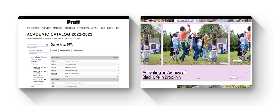
The Older Version (left) vs the Newly Launched (right)
GOALS
From our eye tracking study we wanted to find out user behavior about three key areas. These goals guided how we shaped the tasks we gave to the participants during the study.

Understanding how users browse the website

Identifying what works and
what doesn't

Making the application process effective and intuitive
PROCESS
From planning to presenting
The study was broken down into six stages. The first phase was preparing the study which included defining the goals and designing the study. The second phase was conducting the study which included recruitment of participant and conducting 8 moderated testing sessions. The third phase was analyzing the data and making design recommendations for improvement.

TECHNIQUES & TOOLS
Moderated Eye tracking study
Eye tracking is a biometric technique that measures the location and duration of user's gaze on a stimuli and provides insights on their viewing behavior. This can help find usability issues on digital interfaces.

Moderated Usability Testing
In person testing sessions in the lab where the participants were given four tasks on the Pratt website

Tobii Eye Tracking
It was used to capture a data stream that contains information such as fixation, saccade, the gaze vector for each eye, and gaze point

Retrospective Think Aloud
A gaze replay was shown to the participants and they were asked to think aloud and tell us about how they performed tasks
DESIGNING THE TASKS
Looking at enrollment and graduation requirements most important for prospective students
We created four tasks based on our scenario of a prospective graduate student looking to apply to one of the programs. The tasks were bucketed in two categories of how do they enroll and how do they graduate

PARTICIPANTS
Recruiting prospective graduate students based in New York
We recruited eight participants from a survey shared amongst the Pratt student body and our personal networks. We reached out to respondents who were considering going to grad school currently or in the near future and could participate in-person. They were screened for vision impairments using Nielsen Norman's guidelines to ensure that the eye tracking tool could accurately capture their eye movements.

GENERATING INSIGHTS
Element discoverability and misleading CTAs were top two friction areas
We mapped the insights from each user interview and created an affinity map. The usability issues were identified and the most prevalent problems were discussed. We focused on four of them and created design recommendations and mockups for those.


Infinity map of the insights generated by the team
Infinity map of the insights generated by the team
KEY TAKEAWAYS
Understanding discoverability issues faced by novices and experts that are applying actively

Here are some of the remarks from the user testing sessions. Our participants loved the visual aesthetic, top navigation and found it delightful. However, they had issues discovering information due to font sizes, excessive white space and confusing flows.
We also identified two user groups from our participants. The novice users who are considering to apply but not actively doing so and the experts who are actively applying and familiar with the process. The novices took longer than the experts consistently across the four tasks.

FINDING 1
Most users struggled to discover separate tabs for graduate and undergraduate
7/8 Participants Struggled to differentiate between Undergraduate/Graduate Tabs while looking for the Communication design MFA program.
The current font size and position was really hard to discover and 50% of participants took more than 3 minutes to finish the task
RECOMMENDATION
Emphasize Undergraduate and Graduate Tabs to enhance their discoverability

User quote from the RTA & Gaze replay
FINDING 2
Users overlook links that are Nested in large paragraphs of text
63% had difficultly locating portfolio requirements. Users most often navigated to program department page before exploring the graduate admission page and eventually finding department requirements.
38% continued their search after fixating on the visual portfolio headline.
RECOMMENDATION
Highlight links with color to increase their visibility

User quote from the RTA & Gaze replay
FINDING 3
Users expect to start their application when clicking Apply to Pratt
63% of participants expect to be taken directly to a page that allows them to start their application when clicking Apply to Pratt. Users expected to land on a program specific application or be directed immediately to a page to submit their Application.
RECOMMENDATION
Eliminate unnecessary step in application process

User quote from the RTA & Gaze replay
FINDING 4
Users expect to find all the information related to a program on it’s specific page
When asked to find application requirement for a specific program 63% participants went to the program’s details page first.
The heat map showed that the users were interacting till the page ended but skimmed through walls of text
RECOMMENDATION
Consolidate and organize information based on user needs on program page

User quote from the RTA & Gaze replay
System Usability Scale Rating
The mean SUS score was 77.5. A score over 68 indicates 'Above Average'. The website performed better than 81.2 percent other websites users have used. The Usability score was 73 and the Learnability score was 95.3. Our System Usability Scale Scores tell that despite the usability issues, the website performed well
Client feedback
Our group presented our findings in a presentation deck format along with a problem list and highlight reels. After listening to us this is what our clients said "The negotiation on the apply flow was really helpful and could inform decisions that we take in the future. We really enjoyed the presentation and liked the layout. The block quotes and hearing the users was great! From an accessibility point of view that helped too.
It was interesting to have the users interact with the website as it has a direct conversion rate on the application process. We have to make sure that there is a balance between explanatory text and straight forward clear tasks as it seemed users were only looking at the headlines. I would be curious to learn more about the user behavior on that! Thank you!"

Learnings & Next steps
I really enjoyed working on this project and presenting our findings to the class and the clients. It was a learning curve from having a broad concept of what eye tracking is to actually running a study on it. While moderating tests it was really interesting to capture where the users were looking and the duration for which they did so and then later hearing them talk about it. This allowed us to understand the complete picture both from a biometric as well as cognitive processing level.
For the next steps, I would like to delve deeper and research more on how can the user flows be improved further. I would also be curious to learn about the novices and experts as identified in one of our big picture takeaways and learn more about how they navigate the website differently.